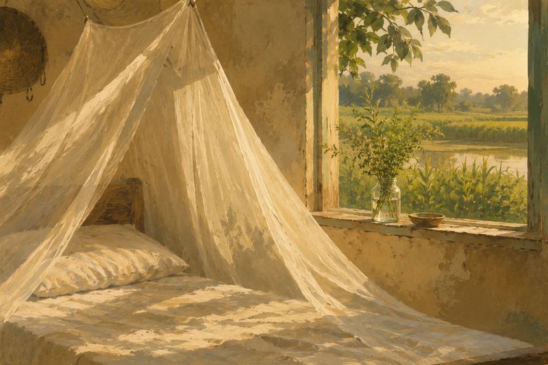
Concept & visual language
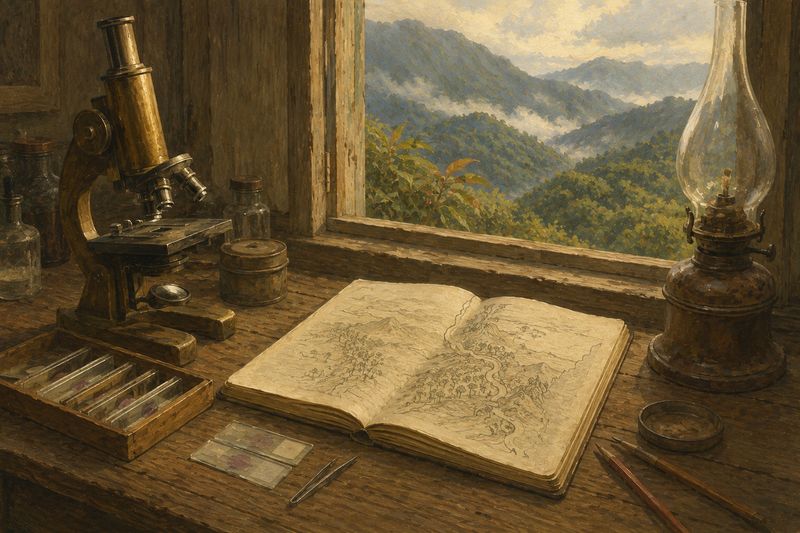
I chose the topic and positioning and defined the "field notebook + museum archive" visual language, the earth-tone palette, and the overall exhibition framing.
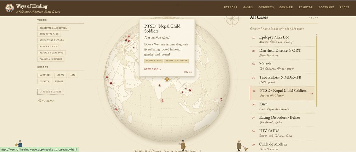
A field atlas of culture, illness & care — an exhibition-style interactive site that maps 17 cross-cultural case studies and 10 core ideas from medical anthropology onto a spinnable globe, with AI guides, a Comparison Lab, and a printable Bookmark Workshop.
Field Atlas · Medical Anthropology · Exhibition UX · AI Collaboration · Senior Capstone
Project Summary
The idea began in a medical anthropology course I took in 2024. The material was deep and fascinating — but there was far too much reading for the time available, and I kept imagining an interactive website that could make learning it feel less like homework and more like visiting an exhibition.
Healing has never been only about seeing a doctor and taking medicine. It is bound up with family, faith, history, the communities we live in, and how we make sense of suffering. Yet when cultural healing traditions show up online, they tend to be either buried in academic papers or framed as something strange and exotic.
The core question became: what if learning how the world understands sickness and care could feel like wandering through a field archive, not studying for an exam?
My earlier interactive atlas, Where Dragons Dwell, placed 3rd in the 2026 Codex Creator Challenge and proved the map-based exhibition model. Ways of Healing takes that starting point into far more sensitive territory — illness, trauma, and care — with a completely different subject, audience, and content system.
Audience
Early critique pushed me to stop listing possible audiences and actually choose one. When a design decision serves one group at the expense of another, this is who I protect:
Adults who find the topic meaningful or personally resonant — through immigration, multicultural families, or caregiving — and want a respectful, visual way in. They are not extracting facts; they are seeking recognition and understanding.
Instructors who can use the atlas as a discussion starter or pre-class exploration tool — a visual introduction rather than a textbook replacement.
People interested in how complex academic content becomes an interactive system. They are an audience for my process, not the content — so they never drive the user experience.
My Role
I did not code this project line by line. I acted as director; AI (Claude and Codex) acted as researcher and builder. Every part of the site followed the same loop: I set the goal and constraints, the AI produced a draft or a working build, I reviewed it page by page, and the AI revised until I signed off. The AI never set direction on its own.
I chose the topic and positioning and defined the "field notebook + museum archive" visual language, the earth-tone palette, and the overall exhibition framing.
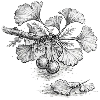
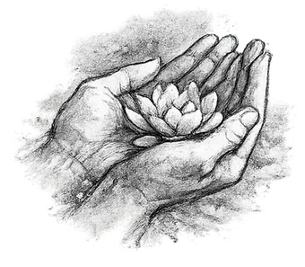
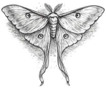
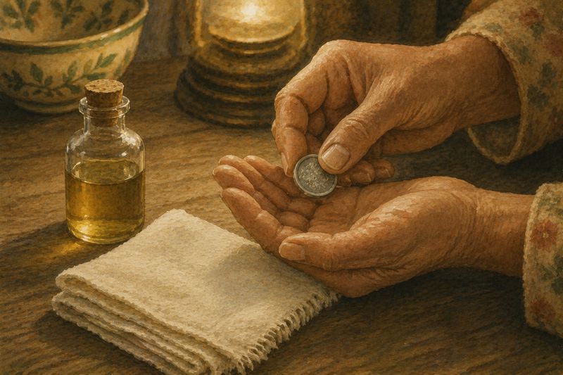
I fixed the content scope and the cultural-sensitivity rules, and set a strict illustration standard: no clear faces, no wounds or remains, no aestheticizing of suffering.
I compared three homepage prototypes and chose the vector globe, set the "interactive, not heavy" principle for case pages, and decided the structure page by page.
Performance testing, API keys and environment variables, git commits, and the Vercel deployment were mine alone.
Three risk rules kept the style honest: not too decorative, not a treasure map, not cute — because the subject is illness, trauma, and poverty.
Design Process
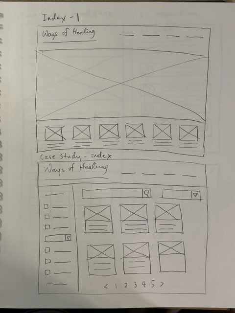
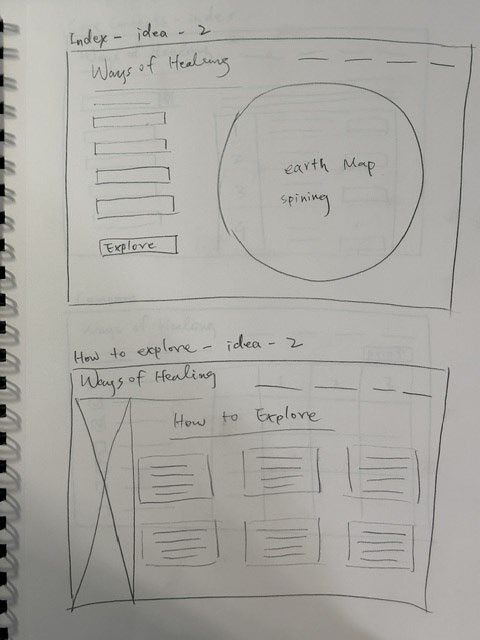
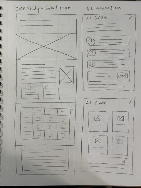
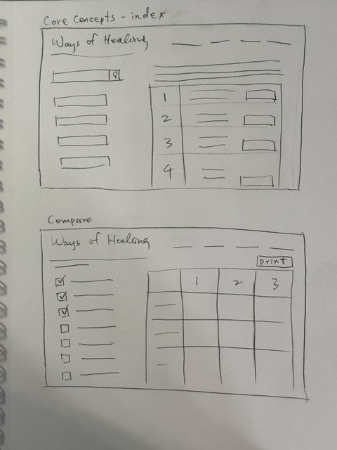
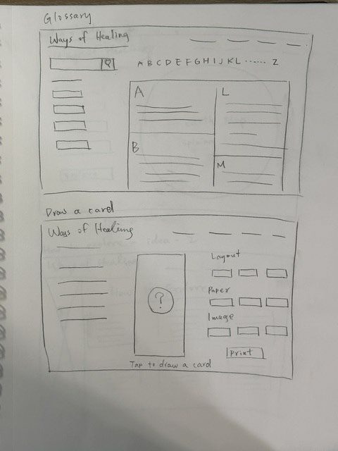
I sketched three homepage directions — a flat world map with filters, an image-led gallery, and a rotating vector globe — then used AI to prototype each one before committing to the globe. The same sketchbook shaped the case pages, the Comparison Lab, and the Bookmark Workshop.
Structure
The globe is the front door, but there are five ways in: cases, concepts, themes, comparison, and an AI guide. Underneath, a single source of truth (catalog.js) feeds shared scripts that render every page, so content stays consistent across the whole site.
Key Features
Seventeen heavy academic cases retold in plain language, broken into flip cards, sticky notes, expanders, progress bars, and Q&A — interactive instead of text-walled.
Pull two or three case cards from a filing cabinet onto the table and compare cause, treatment, spirit/body, and community — then print the result.
The site-level Atlas Guide points you to relevant cases; each case page's Case Guide answers in depth. Both refuse medical advice by design.
A daily draw of three printable bookmarks — choose one, pick an illustration, sign it, cut along the dotted line. A souvenir stand for a virtual exhibition.
Cut-paper "walkers" stroll along the bottom of each page — defined by what they carry, never by ethnicity. Click one and it stops to speak a short in-character line, like an NPC in a quiet game. Usability feedback later earned them an on/off toggle.
Herbalist (basket & sprig) · Lantern bearer (stigma stories) · Field scholar (map tube) · Water bearer (two buckets) · Caregiver (swaddled child) · Book carrier · Bowl bearer · Letter carrier · Medic · Elder · Parent & child · Dog walker
Accuracy
AI drafted content from roughly forty-five medical-anthropology sources — and its output looked about 80% correct, which is the dangerous kind of correct. I ran three full audit rounds against the actual sources under four standards:
The audits removed invented statistics, corrected mistitled references, fixed numeric errors, and rebuilt the bibliography to 57 verified works. Where a figure couldn't be confirmed, I kept the statement general rather than invent detail. The same discipline applied to images: I approved or rejected all 51 illustrations one by one — an early HIV illustration was rejected because the AI had drawn a coronavirus.
Illustration rules were non-negotiable: no clear faces, no wounds or remains, no aestheticizing of suffering.
User Research
The written comments pointed one direction: readability. I enlarged type across the site, cut the handwritten typeface to reduce font noise, and demoted the "How to Explore" page out of the global nav to lower cognitive load.
A single-participant, think-aloud session with "Kevin," 40, an engineer and museum-goer — a fair proxy for the general-interest audience. One participant can't measure how common a problem is, but he can find real ones:
Case and concept pages still carried an old "Explore" link that was meant to be gone. Kevin surfaced it in minutes.
Both assistants were called "Field Guide," so their purposes blurred. They became the Atlas Guide and the Case Guide, each with a scope note.
The figures charmed at first, then distracted. A visible, remembered on/off switch now layers over reduced-motion support.
"Across the Atlas" confused; "Related Cases" doesn't. Several confusions traced to the same root cause — evocative names chosen over plain ones.
Renaming "By Theme" to "By Case" would flatten five genuinely different entry axes. The real duplicate was a redundant index shortcut.
Rests on one participant and pulls against the survey's "reduce cognitive load" finding. Parked as a hypothesis.
He didn't want to read instructions first — he wanted to begin exploring immediately. — field note from Kevin's session, and the best argument for demoting the how-to page
Outcome
Ways of Healing shipped as a complete, live atlas: 17 cases, 10 concepts, five entry paths, two scoped AI guides, and a souvenir stand — all in a visual language that treats illness and care with respect rather than decoration. The architecture assumes growth, so new cases can join the catalog without touching the design.
Two lessons I'm keeping. First, users won't necessarily accept a designer's favorite ideas — the walkers needed a toggle, and the evocative labels needed to become plain ones. Second, a designer paired with AI can multiply their output several times over — but only if the collaboration is transparent and the human owns the judgment, the sensitivity calls, and the accuracy standard.
Spin the globe, read a case, compare two ways of healing, and print yourself a bookmark on the way out.