Not a diet app
The product needed to avoid shame, restriction, and calorie obsession. The tone had to stay practical, calm, and non-judgmental.
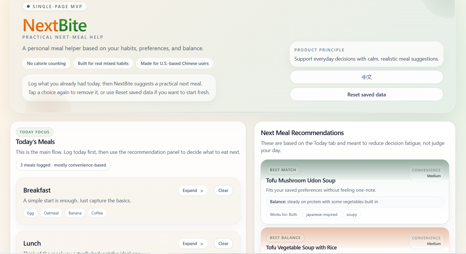
A bilingual meal decision helper for U.S.-based Chinese users — designed to reduce decision fatigue with practical next-meal suggestions based on what they already ate, their weekly patterns, and how they feel today.
Context
NextBite started from a very specific gap: many meal recommendation experiences feel either too generic or too judgmental. I wanted to design something that acknowledges how people actually eat — home-cooked Chinese meals one day, takeout bowls the next, soup, sandwiches, snacks, and grocery shortcuts in between.
The target audience was U.S.-based Chinese users who needed practical next-meal help, not calorie tracking. That product stance shaped the tone, the data model, and the interface from the beginning.
The key design principle was simple: help people decide what to eat next without making them feel judged.
Early Framing
The project began with a simple frustration: every food question started from scratch. I could ask what to eat next, but the system did not remember what I had eaten earlier in the week, what my usual preferences were, or how my habits were shifting over time. That made each decision feel more repetitive than it needed to be.
Very early on, I knew this should not become another calorie-tracking or weight-loss tool. The more useful opportunity was a product that could remember recent eating context, respect personal taste, and reduce the mental effort of deciding on the next meal.
The product needed to avoid shame, restriction, and calorie obsession. The tone had to stay practical, calm, and non-judgmental.
The target user was a U.S.-based Chinese user with mixed eating habits — someone who may move between Chinese, Japanese, Korean, American light meals, grocery shortcuts, and takeout in the same week.
I intentionally scoped the first version as a single-page web app with lightweight logging, 7-day memory, and explainable recommendation logic instead of trying to build a full nutrition platform.
The core product question became: how can this tool remember what I have been eating, understand my changing preferences, and help me decide what to eat next without making food feel like work?
Challenge
This project was intentionally scoped as a front-end MVP: no authentication, no database, no external APIs. That meant the product had to feel useful using only localStorage, rule-based logic, and well-structured metadata.
Users needed to log meals quickly with chips, dropdowns, and grouped options instead of typing everything manually.
The recommendation engine had to feel grounded in actual user inputs while staying simple enough to tune and maintain.
The copy had to stay supportive and practical — avoiding diet-culture language while still talking about balance.
System Design
I built the recommendation model around metadata-rich meal options and readable helper functions. Instead of pretending to be scientific, the system estimates rough signals like protein, vegetables, carbs, heaviness, convenience, sweet drinks, alcohol, and recent weekly patterns.
The scoring system then compares each meal option against those signals, along with preference tags, avoid tags, time of day, and variety rules. Meals that better support the user's current context move up, while repetitive or conflicting options move down. I kept this logic intentionally rule-based in the MVP so the recommendations would stay explainable, tunable, and easy to refine.
Each meal captures protein, vegetables, carbs, fruit, soup, drink, cooking method, source, and portion. I also expanded the food lists to better match North American grocery and takeout realities.
The app derives rough daily and weekly patterns from saved logs so the recommendation cards react to what happened today without ignoring the user’s recent habits.
Meals are scored against preference tags, avoid tags, eating style, time of day, how the user feels today, and variety rules so the top three cards feel distinct rather than repetitive.
Key Decisions
I added English / Chinese switching for UI and recommendation copy, while intentionally keeping many meal names in English. For this audience, that felt more natural than fully translating every food label.
I restructured the page so Today’s Meals and recommendations come first. Past days still matter, but mainly as supporting context for the weekly snapshot and recommendation engine.
I replaced a generic sex field with “How you feel today,” which made the app more respectful and more useful. Warm meals, low-energy days, and lighter options became explicit, user-controlled inputs.
Product Detail
One part I cared about a lot was keeping the recommendations readable and human. The scoring is modular, but the output had to sound like a calm helper rather than a calculator.
AI Collaboration
I used AI throughout this project as a product-thinking, coding, and iteration partner. It helped speed up implementation, but it did not replace the design judgment behind the product.
In other words, AI made the build process faster, but the product direction, prioritization, and final decisions were still mine.
Logic Tension
As the product grew, the real challenge was no longer generating more options. It was making the recommendation system stay coherent as more rules, preferences, and edge cases were added. A recommendation engine can be technically functional and still feel wrong if the logic starts colliding with itself.
I had to keep checking for situations where multiple valid rules pulled in different directions at once: someone might want a warm drink but also avoid caffeine, prefer both tea and juice, need more protein overall but already have repeated the same protein twice, or trigger dinner timing, feel-today inputs, and avoid tags at the same time. Those overlaps were where the product either became trustworthy or started to feel arbitrary.
A larger dataset only mattered if the meals could actually surface. I treated reachability as a product quality problem, not just a code problem, because a meal that never appears is effectively not part of the experience.
Scoring had to match common sense. If a user avoided caffeine, recommending tea weakened trust immediately. The same was true when tofu kept reappearing after multiple tofu meals, or when sparse logs still produced overly confident weekly summaries.
The more logic I added, the easier it was for the system to become a black box. I kept pushing the MVP toward explainable, evidence-based behavior so users could feel that the product was reacting to their inputs for understandable reasons.
The hardest part was not making the app produce recommendations. It was making those recommendations feel reachable, readable, and believable at the same time.
Reflection
NextBite shows how I think about products end to end: not just visuals, but information structure, interaction clarity, rules-based UX logic, and user trust. The most important work was not simply “making the UI pretty” — it was deciding what the product should pay attention to, and what it should deliberately avoid.
If I continued this project, the next meaningful step would be moving from local-only history to cloud sync and accounts. But for an MVP, I think the most important thing was already achieved: the app feels lightweight, understandable, and genuinely useful.