Task 01 — New Family
A new parent finds a program, locates the school, and downloads a registration form
Redesigning Houston's oldest nonprofit Chinese school website — from a fragmented, outdated experience into a unified, parent-friendly platform.
Figma · WordPress
Project note: The live website has since been redesigned by another team. This case study documents the UX and visual design work I contributed during my internship.
Background
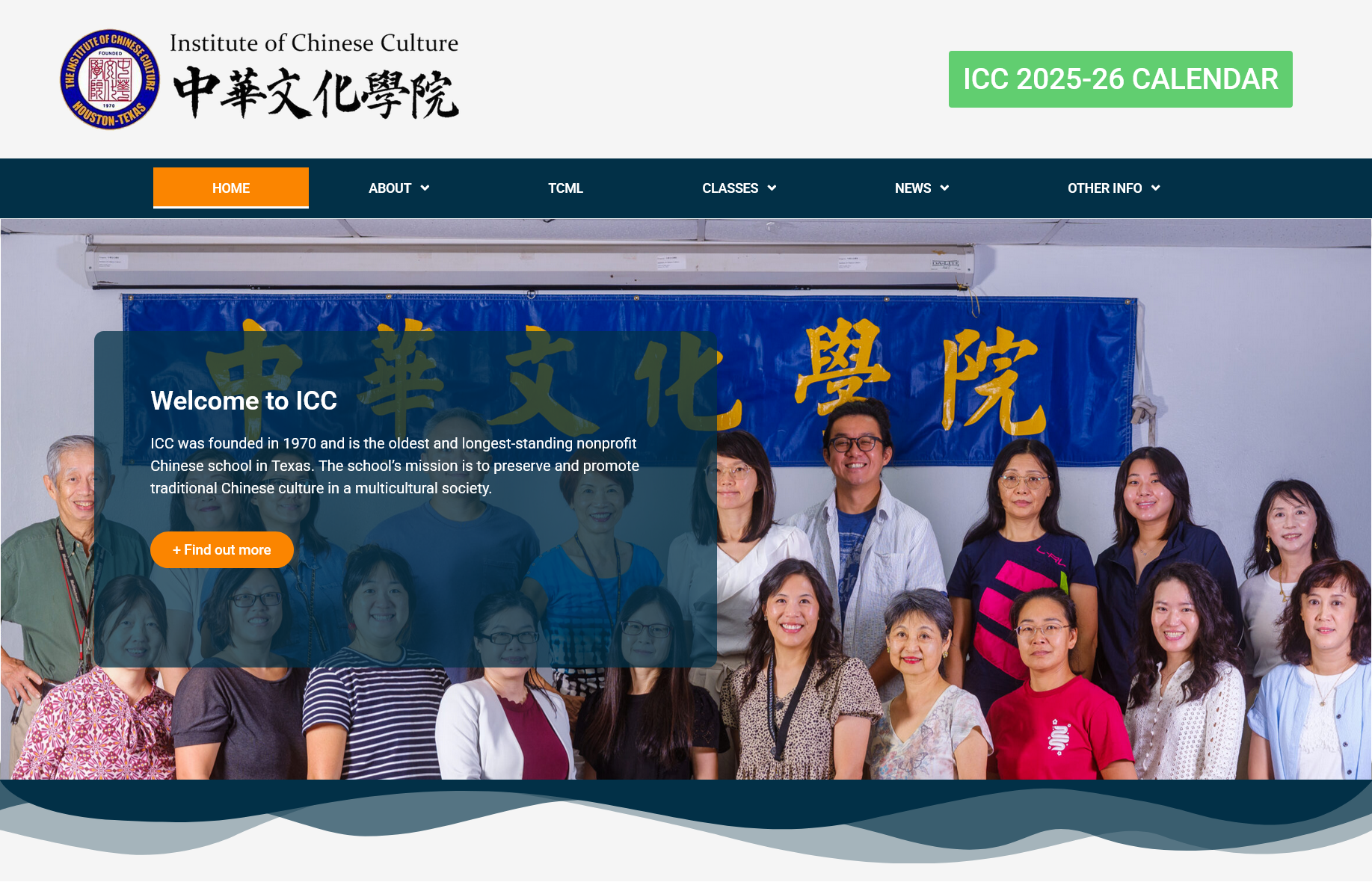
The Institute of Chinese Culture (ICC), founded in 1970, serves hundreds of Houston families across Saturday Chinese School, a Mandarin Immersion Preschool, and Adult Classes.
I was brought in as the sole UX designer to lead the redesign from research through prototyping, working directly with school leadership and a development team in Bangalore.
Problem
Through stakeholder interviews and analysis of the existing site, five core pain points emerged:
Two websites with overlapping content created confusion for new and returning families alike
Critical pages (Faculty, Gallery, Registration) were hidden inside a "Quick Links" dropdown — not intuitive
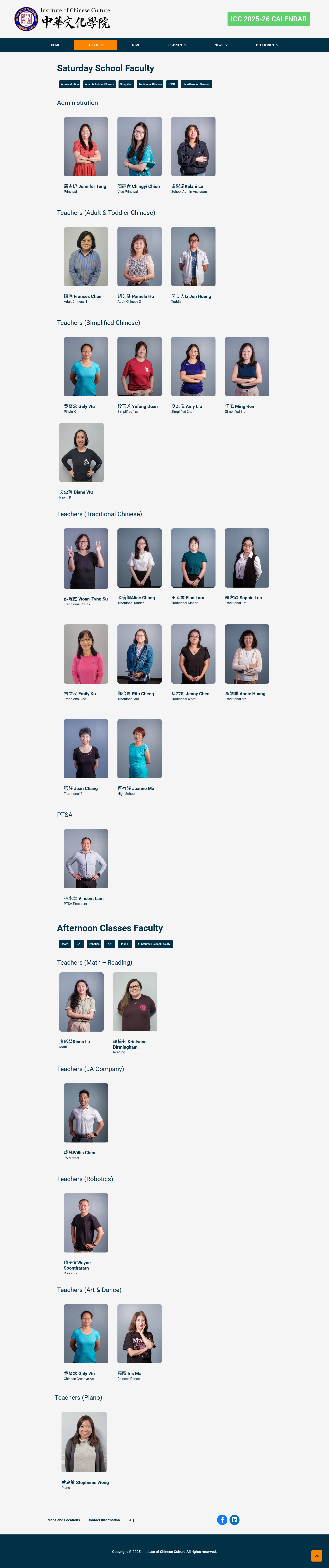
Faculty information was spread across 3 separate pages with no visual structure or hierarchy
Registration forms were plain-text links with no visual guidance or clear calls-to-action
Outdated visual design (copyright 2021) eroded trust with prospective families
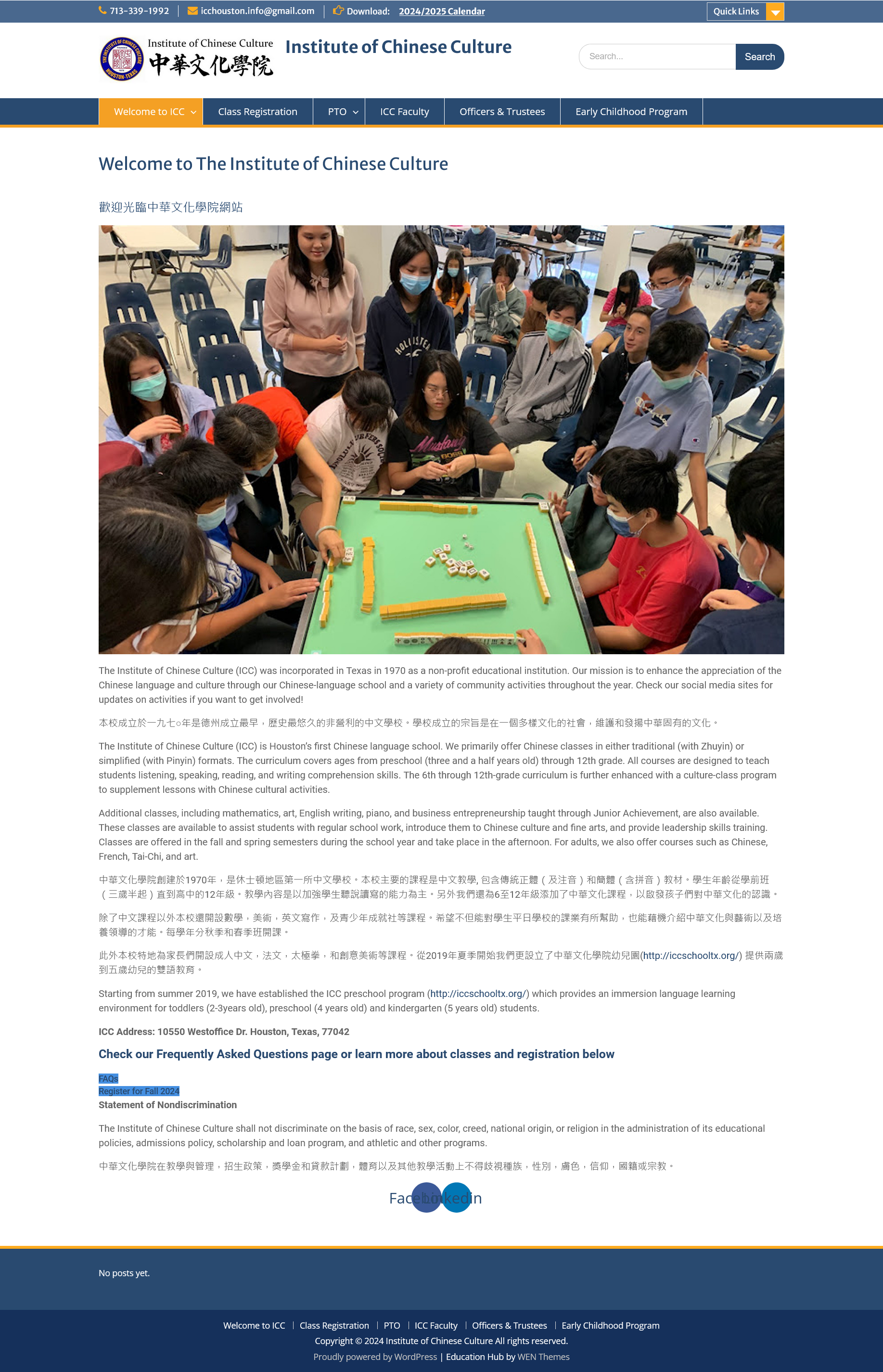
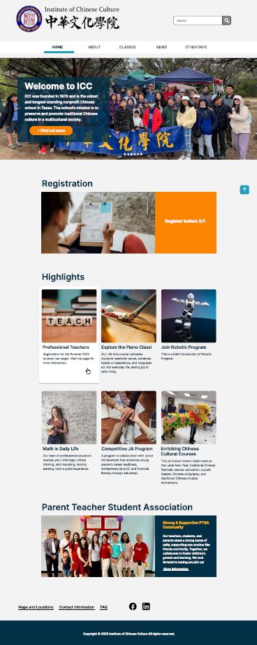
Before: confusing navigation with hidden links / After: clear top-level structure with sidebar sub-nav
Research
I conducted interviews with three key school staff members to surface real needs, and defined two user tasks to anchor the design process.
Principal
Tina
"The site should feel professional and modern — I'd like it to be closer to St. John's School."
Vice Principal
Jennifer
"We need to clearly separate the three programs so parents don't confuse them."
Registrar
Jing Yi
"Registration info needs to be much clearer — maybe a tab layout would help."
A new parent finds a program, locates the school, and downloads a registration form
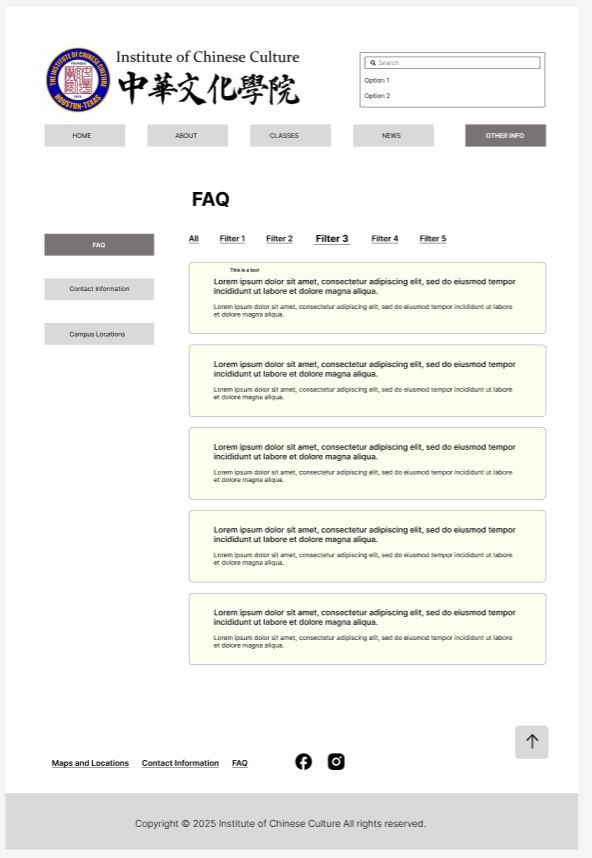
A returning parent finds their class, reads the FAQ, and registers online
Information Architecture
Rather than merging the two sites, I designed a clear hierarchy: icc-houston.org as the primary destination, with contextual links guiding users to iccschooltx.org for Pre School details. This preserved both domains while eliminating the confusion of parallel structures.
View IA in FigmaIA flow mapping ICC_1 (main site) vs ICC_2 (Pre School branch) — created in Figma
Design Decisions
Decision 01
Replaced flat nav + hidden Quick Links with a clear structure: HOME / ABOUT / CLASSES / NEWS / OTHER INFO, with left-sidebar sub-navigation within each section. No more buried pages.
Before:

After:
Decision 02
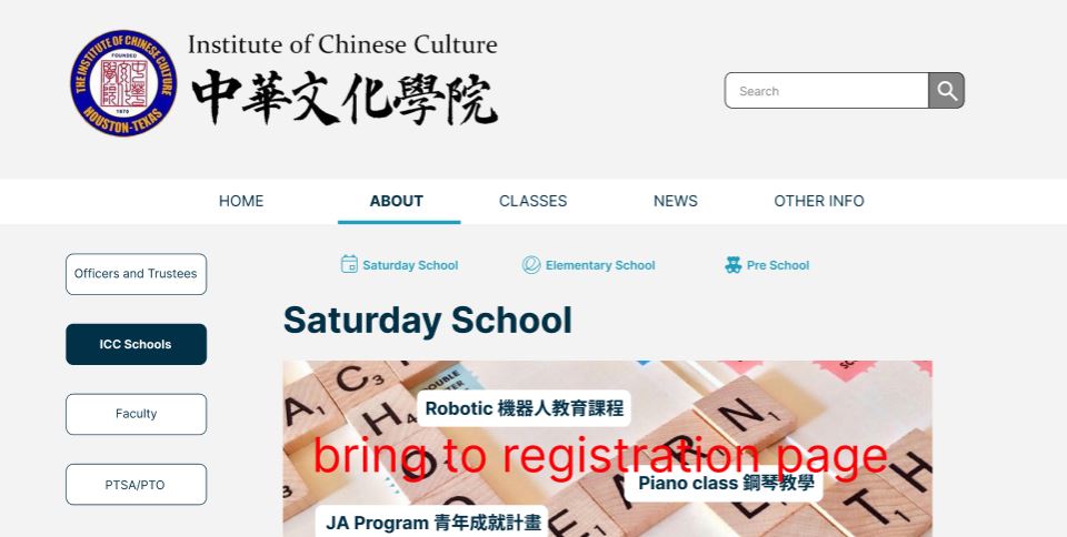
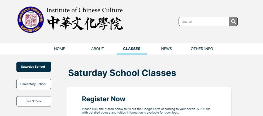
Used consistent tab navigation (Saturday School / Elementary / Pre School) across About, Classes, Contact, and Locations pages — so parents can switch program context without navigating away.
Decision 03
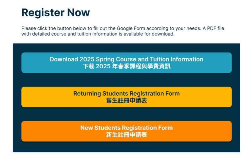
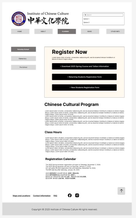
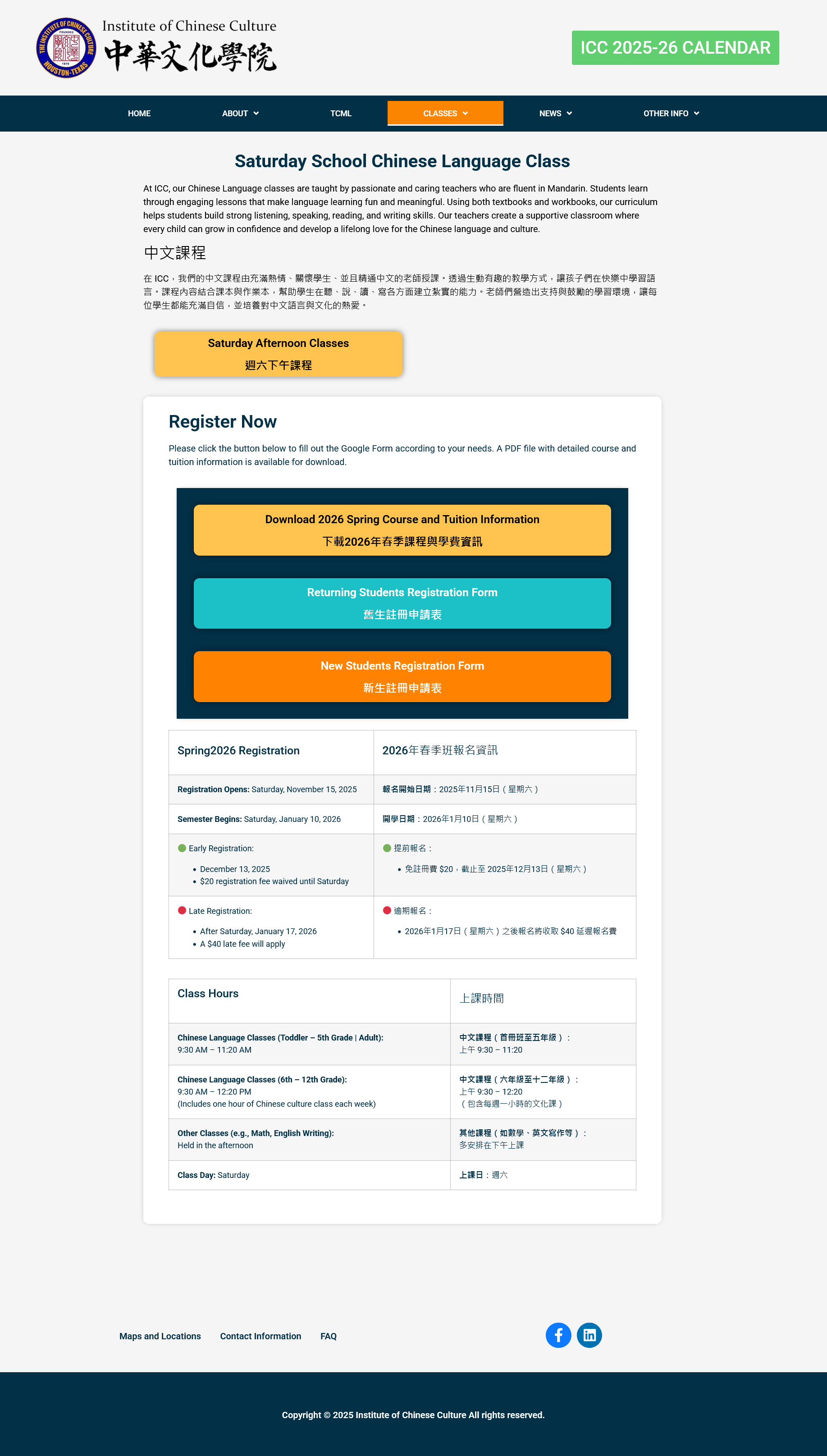
Moved registration to the top of both the homepage and Classes page. Three clearly labeled buttons replace plain-text links, reducing friction for the site's most critical task.
CTA Button at Homepage:

CTA Buttons at Classes Page:
Decision 04
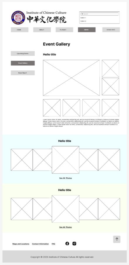
Each event album shows a 5-photo preview with a "See All Photos" link to the school's Google Drive. The site stays lightweight, and staff can manage photos without developer involvement.
Decision 05
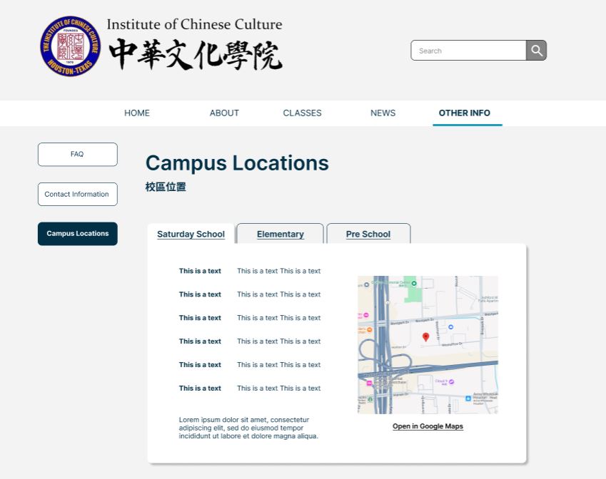
A frequently reported pain point — parents not knowing which campus to go to. Each program tab on the Locations page shows address details alongside an embedded Google Maps preview with a direct link.
Decision 06
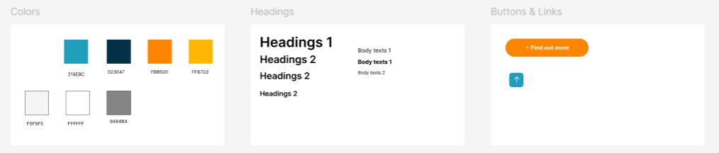
Introduced a unified color palette (Navy #023047 + Orange #FB8500 + Teal #219EBC), clear typographic hierarchy, and bilingual content blocks — replacing the previous ad-hoc WordPress theme styling.
Wireframes
All pages were prototyped in Figma, covering both wireframe structure and visual design. Key flows — homepage, registration, gallery, and locations — were validated with the client before handoff to the development team.
View Prototype in Figma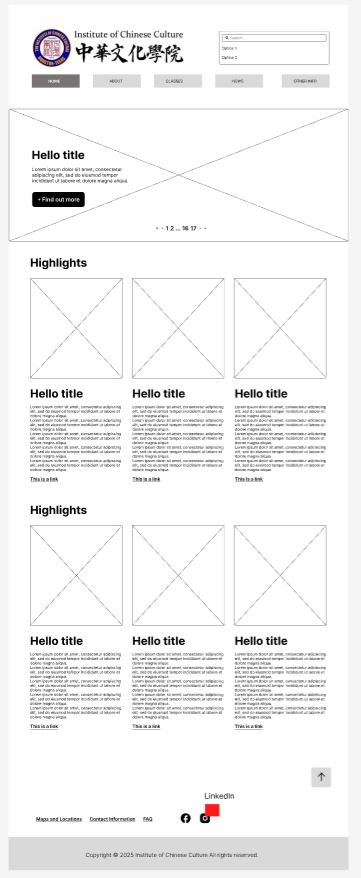
Outcome
The redesigned site launched in 2025 and is now active at icc-houston.org. Key outcomes from the redesign:
Two confusing domains → one navigable experience
Homepage → Classes → Register, no dead ends
School can update content independently via WordPress
"The feedback from the principal, along with the response from parents, has been positive. The layout and information on the new site are much clearer and more concise than before — people can easily find what they need. The principal also finds it straightforward to access the backend and make updates herself."
"When I met with the principal at the end of January, she mentioned that a new parent happens to be a web developer and could rebuild the site in a different language to add a membership and parent registration feature. That was outside the scope of our original plan — WordPress isn't well-suited for that kind of membership management anyway. It would be an entirely new project."
— Project Lead, ICC Houston
Note: The live site reflects client adjustments and WordPress theme constraints made during implementation — some visual and structural details differ from the original Figma prototype.
Reflection
This project reinforced that good UX is as much about structured communication as it is about design. Balancing an outdated CMS, a live site that couldn't go dark during registration season, content arriving in pieces, and a development team working across time zones required clear documentation and pragmatic decisions at every step.
The constraints pushed me to prioritize ruthlessly — every design decision had to justify itself against user needs, not just aesthetic preference.
Run usability testing with actual parents focusing on the registration flow and navigation structure against the two original task scenarios.